
2023-1-18 17:4:0 Author: www.uedbox.com(查看原文) 阅读量:38 收藏
- 发表于
- flutter
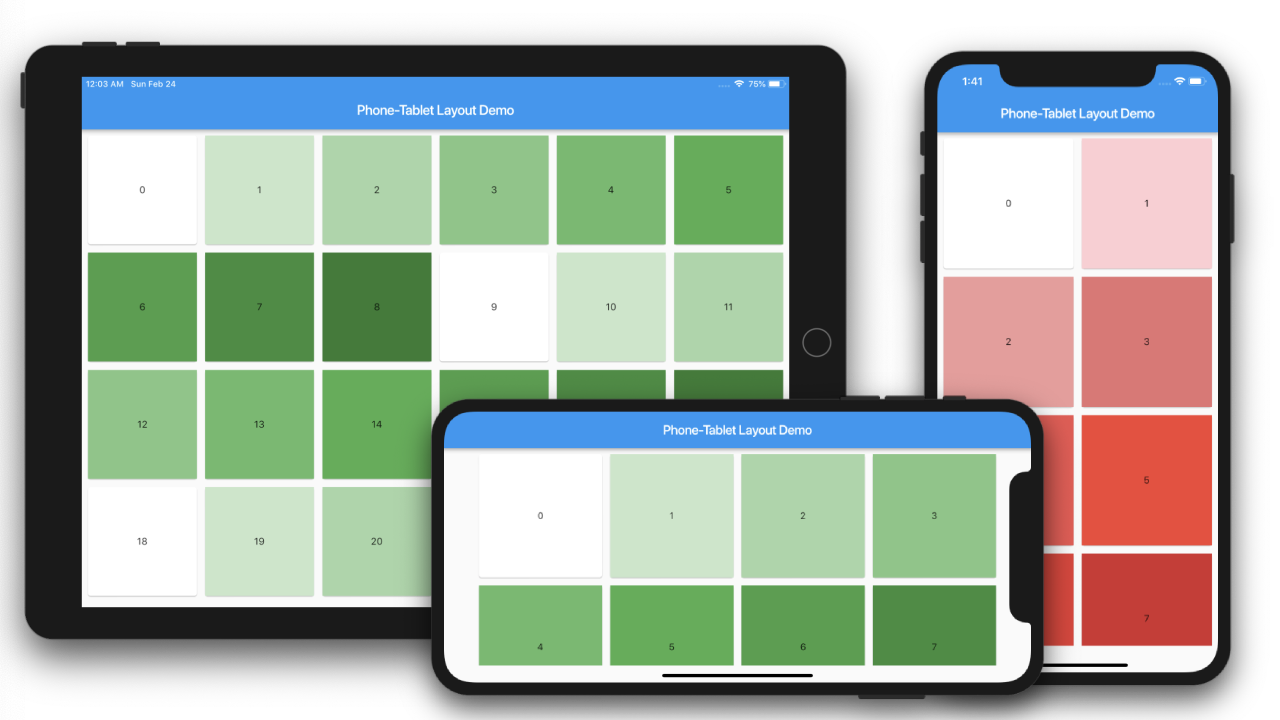
本文将向您展示如何创建根据用户设备(手机或平板电脑)运行的布局。在这里,我们将创建两个 GridView,一个用于手机,另一个用于平板电脑。
让我们先创建返回两个 GridView 的函数。
|
1 2 3 4 5 6 7 8 9 10 11 12 13 14 15 16 17 18 19 20 21 22 23 24 25 26 27 28 29 30 31 32 33 34 35 36 37 38 39 40 41 |
gridviewForPhone() { return Padding( padding: EdgeInsets.all(5.0), child: GridView.count( crossAxisCount: 2, childAspectRatio: 1.0, mainAxisSpacing: 4.0, crossAxisSpacing: 4.0, children: List.generate(100, (index) { return Card( child: Container( alignment: Alignment.center, color: Colors.red[100 * (index % 9)], child: Text('$index'), ), ); }), ), ); } gridviewForTablet() { return Padding( padding: EdgeInsets.all(5.0), child: GridView.count( crossAxisCount: 4, childAspectRatio: 1.0, mainAxisSpacing: 4.0, crossAxisSpacing: 4.0, children: List.generate(100, (index) { return Card( child: Container( alignment: Alignment.center, color: Colors.green[100 * (index % 9)], child: Text('$index'), ), ); }), ), ); } |
在这里,Phone GridView 将每行显示 2 个单元格,而平板电脑将每行显示 4 个。
使用 MediaQuery
首先,我们使用 MediaQuery 来确定布局。为此,我们将声明三个变量。
我们假设 600.0 作为平板电脑的边界。
final double shortestSide = MediaQuery.of(context).size.shortestSide; // get the shortest side of device final bool useMobileLayout = shortestSide < 600.0; // check for tablet final Orientation orientation = MediaQuery.of(context).orientation; // get the orientation |
现在我们的构建方法将更改为
@override Widget build(BuildContext context) { final double shortestSide = MediaQuery.of(context).size.shortestSide; // get the shortest side of device final bool useMobileLayout = shortestSide < 600.0; // check for tablet final Orientation orientation = MediaQuery.of(context).orientation; // get the orientation return Scaffold( appBar: AppBar( title: Text(widget.title), ), body: useMobileLayout ? gridviewForPhone(orientation) : gridviewForTablet(orientation), ... |
现在我们将方法更改为
gridviewForPhone(Orientation orientation) { ... GridView.count( crossAxisCount: orientation.portrait ? 2 : 4 ... } gridviewForTablet(Orientation orientation) { ... GridView.count( crossAxisCount: orientation.portrait ? 4 : 6 } |
使用 LayoutBuilder
这是进行比较的示例
LayoutBuilder( builder: (BuildContext context, BoxConstraints constraints) { if (constraints.maxWidth < 600.0) { return gridviewForPhone(); } else { return gridviewForTablet(); } }, |
为了简单起见,我们只是使用构建器约束检查设备的最大宽度。
因此,一旦您的设备超过 600.0 的最大宽度,可能在横向模式下它最终会显示平板电脑的 GridView。
完整代码。
如有侵权请联系:admin#unsafe.sh