I’ve just finished setting up a new Mac (14" MBP, M2 Pro, 32G, 4T). It dawned on me that most of my 2023-2-10 04:0:0 Author: www.tbray.org(查看原文) 阅读量:29 收藏
I’ve just finished setting up a new Mac (14" MBP, M2 Pro, 32G, 4T). It dawned on me that most of my really intense interactions with this thing involve looking at “monospace” (i.e. fixed-width) text; in Emacs where I write this blog, in my IDE, and in my terminal. The ones that came with the machine by default are, well, OK, but maybe we can do better. So I got on Mastodon and asked: “Dear LazyWeb: Setting up a new Mac, what are some groovy new monospace fonts for terminals and IDEs?”
Which was like throwing raw meat into the piranha pool. Obviously this is something that geeks care about deeply. I got a huge number of suggestions, of which I downloaded 16, basically all the ones that are free. In general I prefer to pay for things and am suspicious of anything that’s free on the Net, but when there are so many good free options I just don’t think there’s a business model.
Disclosure; for the last two years, I’ve been using Inconsolata, which has always pleased my eye, and also is the only font whose inventor I’ve met; I admire Raph Levien extremely. Can I replace it?
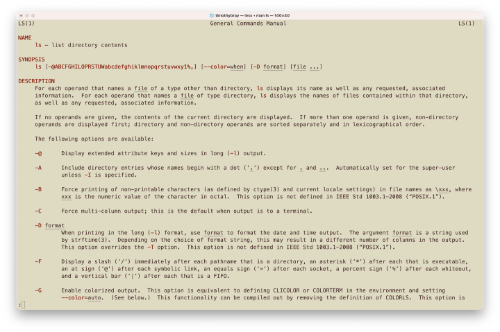
Method · I loaded up the man page for ls(1) in the MacOS Terminal program, with size set to 18pt. By doing so I’m bypassing one important criterion: Readability at small size. I suspect that an increasing proportion of geeks, like me, in this era of 27-inch-and-up 4K screens, don’t really squish the letters the way we did when we were twentysomethings on screens with only a million dots. But if you still do, this piece probably won’t help you that much.
So let’s run through those screenshots. I’ll switch Emacs into each font as I write about it. I’ll pick the ones that I think are generally the most pleasing and do another screenshot of a moderately complex chunk of Go code as presented by JetBrains’ excellent GoLand IDE.
Here they are, in alphabetical order.
B612 Mono · Start here.

Originally commissioned by Airbus as an “Aeronautical Font” for use on aircraft cockpit screens.
It has a few lower-case serifs, reasonably done. It’s little more vertically dense than my eyes like. Could live with it. Doesn’t advance.
Droid Sans Mono · Start here.

Commissioned by Google in 2007, said to be optimized for small handset screens.
I lived in this typeface when I was in the Android group 2010-12. It’s perfectly OK but just uses too much horizontal space for me. While it looks nice in my Emacs buffer, it fails at the information-density bar and doesn’t advance.
Fira Code and Fira Code Retina · Start here

· · ·

“Programmers use a lot of symbols, often encoded with several characters. For the human brain, sequences like ->, <= or := are single logical tokens, even if they take two or three characters on the screen…”
This is an open-source thing by Nikita Prokopov, said to be optimized for code. Its big selling point is a set of ligatures for things like “≠” for “!=”. Meh; all these years in, my eyes don’t care.
For a font that doesn’t market its typographic values much, it sure pleases my eye; light, clear, well balanced horizontally and vertically.
It comes with an ordinary selection of styles: Normal, Light, and so on. But then there’s also “Retina”. It’s difficult to find an explanation; one assumes some sort of optimization for high pixel density? Anyhow, it makes me happy; just the tiniest bit of extra weight that to my eye makes each character speak its nature a little louder.
The Retina style advances.
Go Mono · Start here.

By Bigelow & Holmes.
Wow, so many serifs. That strikes me as inconsistent with Go’s design aesthetic, which eschews decoration and fancy features. Aso, it is notably more vertically compact than the average, which makes my Emacs editing screen look cramped; in code, which typically has shorter lines, that’s probably not so much of an issue?
Advance to the next round? Honestly, probably not. But I’m going to advance it anyhow because after all, stage 2 involves Go code, which this is said to excel at.
Hack · Start here.

“Designed for the screen. Open source. Libre.”
A little tighter vertically and looser horizontally. Which is arguably a good choice for code, with its shorter lines. Looks nice in my editor buffer too. Advances.
IBM Plex Mono · Start here, because IBM’s own page doesn’t seem to show off the mono weight.

The Plex family displaced Helvetica after more than fifty years as the IBM corporate font.
Uh, no, it smells of mainframes. Look at some of those 90° serifs, right out of the 1950’s.
Inconsolata and Inconsolata Light · Start here.

· · ·

“ I was particularly struck by the beauty of Luc(as) de Groot's Consolas, which is his monospaced design for Microsoft’s upcoming Vista release. This font, similar to his earlier TheSansMono, demonstrated clearly to me that monospaced fonts do not have to suck.” —Raph Levien
Unfortunately I am failing to find the words to explain why this pleases my eyes so much; a screenful of it makes me happy. It suffers from several sins for which I fault other faces, but even so. More compact than this overview’s average but so graceful that I’ll take that and welcome the information density. Advances.
The Light variant also pleases my eyes — even more, a bit. But I don’t think it can quite carry the load of all-day every-day work.
Input Mono · Start here.

All other issues aside, there’s just not enough size differentiation between upper and lower case for me. Doesn’t advance.
Iosevka Term · Start here.

“A monospace programming typeface, built declaratively using custom typeface generation software, and with an emphasis on compatibility with CJK characters.”
It probably needs to be evaluated in a CJK-heavy application. It definitely, to my eye, has the look of technical printing I saw in Japan way back in the day. But for those of us whose coding lives are mostly in Latin characters, no.
JetBrains Mono · Start here.

“A typeface for devceblopers.”
And JetBrains knows a lot about developers. This font is so overwhelmingly clear that I can hardly even see it. I can’t think of anything to say, which means it’s doing what it’s designed to do. Advances.
MesloLGS NF · Start here, I guess? Having trouble finding much commentary.

When I switch between this and JetBrains, the occupied space shrinks a little, but wow, other than that it looks really about the same. Density is good. Which do I prefer? Hmmmm… but it advances.
Overpass Mono · Start here.

“Inspired by Highway Gothic.”
Um, no, not really, the letterforms are just too stark, drawing attention to themselves. Doesn’t advance.
SF Mono · Start here (at Apple).

Derived from San Francisco, per Apple “This neutral, flexible, sans-serif typeface is the system font for iOS, iPad OS, macOS and tvOS.”
Yes, but not derived that well, I wouldn’t say. The lower-case letters are working too hard, mannered even; consider the “r”. I’m normally happy to take whatever Apple says is best for my general-purpose daily driver, but this one doesn’t meet my bar for an developer’s font.
Source Code Pro · Start here.

“Designed by Paul D. Hunt and Teo Tuominen.”
This is from Adobe, obviously a heavyweight in the world of design and typography; was authored in-house. Inerestingly, when I switch back and forth between this and SF Pro, the shape of the text doesn’t change; the character metrics are identical. The glyphs do change in interesting ways. Source Code is simpler, less mannered, but neither does it really please my eyes nor get out of the way.
The finalists · That leaves Fira Code Retina, Go Mono, Hack, Inconsolata, JetBrains Mono, and MesloLGS NF. Let’s go look at some actual code, from this file.
Here they are, but they’re not alphabetical, because I want you to look at them; scroll back and forth a bit. See if you draw any impressions before you check which is which.

· · ·

· · ·

· · ·

· · ·

· · ·

Notes · In no particular order:
I cheated and included Inconsolata Light.
They all kind of look like each other. Which I guess shouldn’t be surprising.
In fact, they’re all pretty great.
There are several opportunities for a “≠” ligature in the code fragment. I don’t think it makes a damn bit of difference.
If you care about how many lines of code you can see, Hack squeezes the most into your window, JetBrains Mono the least. Um, I care.
You can tell which is which by click-to-enlarge and look at the labels, or the filenames.
Conclusions? · I don’t think Go Mono really belongs in the top tier, even though it was designed for the language in the sample.
Nor does Inconsolata Light, actually, although I think it looks great.
I could be super-happy with any of Fira Code Retina, Hack, JetBrains Mono, or Inconsolata. Happy enough, I suspect, that the choice doesn’t matter.
如有侵权请联系:admin#unsafe.sh