2023-3-30 11:36:0 Author: code.tutsplus.com(查看原文) 阅读量:7 收藏
Get a hands-on crash course in building an effective and attractive UI for your Android app, and design an interactive quiz app along the way!
For an Android app developer, user interface (UI) is key. Your app may boast cutting-edge functionality, but if it’s wrapped in an unappealing UI it’s unlikely that users will stick around long enough to discover just how great your app really is.
This tutorial provides a hands-on crash course in building an effective UI, using the example of a simple quiz app.
Our quiz app will have the following features:
- The app will use a combination of
ConstraintLayoutandLinearLayoutto position the UI elements. TheContstraintLayoutis pretty powerful and allow you to apply contstraints based on margins, relative positioning and more. - We will implement a scoring system where a click on the correct answer will increase the score and a click on the wrong answer will result in a penalty.
- We will use the shape drawable to create the background of different UI elements. This saves us from the headache of creating multiple image variants as drawables.
- We will also define a style resource for our options and see how it prevents duplication of code.
Let's get started.
Creating a New Project
Before we can start designing our quiz app, we will have to create a new project.
Open Android Studio and the click on the New Project button. This will take you to another screen where you can choose from different activities to get some boilerplate code. Pick the Empty Activity here and then click Next.
Fill out the following details on the next screen.


The app name is what the users will see when the launch your app and multiple apps can have the same name. I have set the name to Quiz App. The package name has to be unique for every app on the Play Store. I have set mine to com.tutsplus.quizapp. We are using Kotlin as our app development language and the minimum SDK has been set to 24.
Click Finish and you will be good to go.
Designing the App Layout
The first file that we will edit is the activity_main.xml file. This file contains information about all the UI elements in our app. The activity_main.xml file contains a single TextView within a ConstraintLayout by default. We will update it to have to following XML.
1 |
<?xml version="1.0" encoding="utf-8"?>
|
2 |
<androidx.constraintlayout.widget.ConstraintLayout xmlns:android="https://schemas.android.com/apk/res/android" |
3 |
xmlns:app="http://schemas.android.com/apk/res-auto" |
4 |
xmlns:tools="http://schemas.android.com/tools" |
5 |
android:layout_width="match_parent" |
6 |
android:layout_height="match_parent" |
7 |
android:background="@drawable/app_background" |
8 |
tools:context=".MainActivity"> |
9 |
|
10 |
<TextView
|
11 |
android:id="@+id/title" |
12 |
android:layout_width="wrap_content" |
13 |
android:layout_height="wrap_content" |
14 |
android:text="@string/app_title" |
15 |
android:textColor="@color/white" |
16 |
android:textSize="36sp" |
17 |
android:layout_marginTop="50dp" |
18 |
android:fontFamily="sans-serif-black" |
19 |
android:background="@drawable/title_background" |
20 |
app:layout_constraintStart_toStartOf="parent" |
21 |
app:layout_constraintEnd_toEndOf="parent" |
22 |
app:layout_constraintTop_toTopOf="parent" |
23 |
app:layout_constraintBottom_toTopOf="@+id/quiz_question" /> |
24 |
|
25 |
<TextView
|
26 |
android:id="@+id/quiz_question" |
27 |
android:layout_width="match_parent" |
28 |
android:layout_height="wrap_content" |
29 |
android:padding="10sp" |
30 |
android:text="@string/first_question" |
31 |
android:textColor="@color/green_700" |
32 |
android:textSize="26sp" |
33 |
android:textStyle="bold" |
34 |
android:fontFamily="monospace" |
35 |
android:layout_marginTop="30dp" |
36 |
app:layout_constraintEnd_toEndOf="parent" |
37 |
app:layout_constraintStart_toStartOf="parent" |
38 |
app:layout_constraintTop_toBottomOf="@+id/title" |
39 |
app:lineHeight="36sp" /> |
40 |
|
41 |
<TextView
|
42 |
android:id="@+id/score" |
43 |
android:layout_width="wrap_content" |
44 |
android:layout_height="wrap_content" |
45 |
app:layout_constraintBottom_toBottomOf="parent" |
46 |
app:layout_constraintLeft_toLeftOf="parent" |
47 |
android:layout_marginTop="20dp" |
48 |
android:textSize="22sp" |
49 |
android:textColor="@color/white" |
50 |
android:background="@drawable/score_background" |
51 |
android:padding="10dp" |
52 |
android:focusable="true" |
53 |
android:text="0" /> |
54 |
|
55 |
</androidx.constraintlayout.widget.ConstraintLayout>
|
The above XML will add three different TextView elements to our quiz app screen. The first TextView with the ID title contains the app title.
You should note that instead of directly providing a hardcoded string as the value of the android:text attribute, we are referencing a string resource. This helps us in making our app localized and reach a wider audience. You can read our tutorial to learn more about some common Android app resources.
The layout_width and layout_height values are set to wrap_content for all TextView elements so that they take up only as much space as needed. The only exception is the layout_width attribute of our quiz question which we have extended to the whole parent.
I have also set appropriate values for the textColor, textSize and fontFamily properties. You might have noticed that the length values such as the textSize and marginTop have been specified in sp and dp units respectively. Both these units are density independent but the sp unit is also scaled based on the user's font size preferences.
We will now add the XML for laying out the options just below the TextView for the quiz question.
1 |
<LinearLayout
|
2 |
android:layout_width="match_parent" |
3 |
android:layout_height="wrap_content" |
4 |
android:layout_marginTop="30dp" |
5 |
android:baselineAligned="false" |
6 |
android:orientation="vertical" |
7 |
android:padding="10dp" |
8 |
android:textAlignment="center" |
9 |
app:layout_constraintTop_toBottomOf="@+id/quiz_question"> |
10 |
|
11 |
<TextView
|
12 |
android:id="@+id/option_a" |
13 |
style="@style/OptionStyle" |
14 |
android:onClick="checkAnswer" |
15 |
android:tag="Wrong" |
16 |
android:text="2003" /> |
17 |
|
18 |
<TextView
|
19 |
android:id="@+id/option_b" |
20 |
style="@style/OptionStyle" |
21 |
android:onClick="checkAnswer" |
22 |
android:tag="Wrong" |
23 |
android:text="2004" /> |
24 |
|
25 |
<TextView
|
26 |
android:id="@+id/option_c" |
27 |
style="@style/OptionStyle" |
28 |
android:onClick="checkAnswer" |
29 |
android:tag="Correct" |
30 |
android:text="2005" /> |
31 |
|
32 |
<TextView
|
33 |
android:id="@+id/option_d" |
34 |
style="@style/OptionStyle" |
35 |
android:onClick="checkAnswer" |
36 |
android:tag="Wrong" |
37 |
android:text="2006" /> |
38 |
</LinearLayout>
|
Our quiz options had to be placed vertically one after the other on the app screen. Therefore, it made sense to wrap them all in a LinearLayout. The LinearLayout itself is placed within ConstraintLayout so we can easily control its placement using constraints.
Also note that all our options have two attributes called android:onClick and android:tag. The android:onClick attribute contains a method name defined in our MainActivity.kt file. We will define the method later in this tutorial. The android:tag attribute allows us to store extra information about our view which in this case is simply a string telling us if that particular option is the Correct answer or the Wrong answer.
Defining Our App Resources
Our layout file above contains references to multiple drawables as well as string and color resources. We will be creating them all in this section.
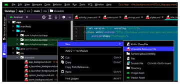
Right click on the drawable directory and then select New > Drawable Resource File from the context menu.


Set the root element to shape in the new window that pops up and set the file name to title_background. Now, add the following XML to the generated file.
1 |
<?xml version="1.0" encoding="utf-8"?>
|
2 |
<shape xmlns:android="http://schemas.android.com/apk/res/android" |
3 |
android:shape="rectangle"> |
4 |
|
5 |
<corners android:radius="20dp" /> |
6 |
|
7 |
<padding
|
8 |
android:bottom="20dp" |
9 |
android:left="20dp" |
10 |
android:right="20dp" |
11 |
android:top="20dp" /> |
12 |
|
13 |
<solid android:color="@color/orange" /> |
14 |
|
15 |
</shape>
|
We are making our shape drawable a rectangle by setting the value of android:shape attribute to rectangle. The drawable contains three other elements. The corners element adds rounded corners to the shape. Using android:radius sets the radius for all corners at once.
We want the drawable to have a single solid color that fills its shape. Setting the android:color attribute achieves this for us. The padding for the View content has to be specified individually for all sides.
Now create another shape drawable by navigating to New > Drawable Resource File and set the file name to score_background this time. Place the following XML inside the file.
1 |
<?xml version="1.0" encoding="utf-8"?>
|
2 |
<shape xmlns:android="http://schemas.android.com/apk/res/android" |
3 |
android:shape="rectangle"> |
4 |
|
5 |
<corners android:radius="10dp" /> |
6 |
|
7 |
<padding
|
8 |
android:bottom="20dp" |
9 |
android:left="20dp" |
10 |
android:right="20dp" |
11 |
android:top="20dp" /> |
12 |
|
13 |
<solid android:color="@color/black" /> |
14 |
|
15 |
</shape>
|
We are using all the same elements but the android:radius and android:color values are different.
Create a third shape drawable by going to New > Drawable Resource File and use app_background as the file name. It will have the following XML:
1 |
<?xml version="1.0" encoding="utf-8"?>
|
2 |
<shape xmlns:android="http://schemas.android.com/apk/res/android" |
3 |
android:shape="rectangle"> |
4 |
|
5 |
<padding
|
6 |
android:bottom="10dp" |
7 |
android:left="10dp" |
8 |
android:right="10dp" |
9 |
android:top="10dp" /> |
10 |
|
11 |
<gradient
|
12 |
android:angle="90" |
13 |
android:endColor="@color/sea_green" |
14 |
android:startColor="@color/yellow_red" |
15 |
android:type="linear" /> |
16 |
|
17 |
</shape>
|
Finally, we will create a drawable resource for the our clickable options. We want the options to have a slightly different background when pressed to indicate to the users that their presses have been registered. The best way to achieve this is with a selector element.
Right click on the drawable directory and then navigate to New > Drawable Resource File. However, keep the root element set to selector this time. Use option_background as the file name. Place the following XML inside the file.
1 |
<?xml version="1.0" encoding="utf-8"?>
|
2 |
<selector xmlns:android="http://schemas.android.com/apk/res/android"> |
3 |
|
4 |
<item android:state_pressed="true"> |
5 |
<shape android:shape="rectangle" android:tint="@color/light_grey"> |
6 |
<corners android:radius="10dp" /> |
7 |
</shape>
|
8 |
</item>
|
9 |
|
10 |
<item>
|
11 |
<shape android:shape="rectangle" android:tint="@color/white"> |
12 |
<corners android:radius="10dp" /> |
13 |
</shape>
|
14 |
</item>
|
15 |
</selector>
|
Our root selector element has two item elements each of which contain a shape element drawable to be used when the item is in different states.
The TextView elements for our quiz options used the style attribute to reference the style rules stored in the styles.xml file under values. This avoided the duplication of some common style attributes. Place the following code inside your styles.xml file.
1 |
<?xml version="1.0" encoding="utf-8"?>
|
2 |
<resources>
|
3 |
<style name="OptionStyle"> |
4 |
<item name="android:layout_width">match_parent</item> |
5 |
<item name="android:layout_height">wrap_content</item> |
6 |
<item name="android:layout_marginTop">20dp</item> |
7 |
<item name="android:textSize">22sp</item> |
8 |
<item name="android:textColor">#000</item> |
9 |
<item name="android:textAlignment">center</item> |
10 |
<item name="android:background">@drawable/option_background</item> |
11 |
<item name="android:padding">10dp</item> |
12 |
</style>
|
13 |
</resources>
|
Make sure that the value of name attribute here matches the value you used for the style attribute of that view. This value would be OptionStyle in our case.
Also update the strings.xml file to have the following XML:
1 |
<resources>
|
2 |
<string name="app_name">Quiz App</string> |
3 |
<string name="app_title">Android Quiz</string> |
4 |
<string name="first_question">What year did Google purchase Android, Inc.?</string> |
5 |
</resources>
|
and the colors.xml file to have the following XML:
1 |
<?xml version="1.0" encoding="utf-8"?>
|
2 |
<resources>
|
3 |
<color name="purple_200">#FFBB86FC</color> |
4 |
<color name="purple_500">#FF6200EE</color> |
5 |
<color name="purple_700">#FF3700B3</color> |
6 |
<color name="teal_200">#FF03DAC5</color> |
7 |
<color name="teal_700">#FF018786</color> |
8 |
<color name="black">#FF000000</color> |
9 |
<color name="white">#FFFFFFFF</color> |
10 |
<color name="orange">#F4511E</color> |
11 |
<color name="sea_green">#C8E6C9</color> |
12 |
<color name="yellow_red">#FFE0B2</color> |
13 |
<color name="dark_green">#FF008800</color> |
14 |
<color name="light_grey">#FFEEEEEE</color> |
15 |
</resources>
|
Adding Interactivity to Our Quiz App
Right now, we have the UI for our app but clicking on any of the options doesn't do anything. We will now write some code inside the MainActivity.kt file in order to update the score whenever an option is clicked.
The code inside our MainActivity.kt file looks like as shown below. Some of this would already be present in your file. Add the rest of it and you will be good to go.
1 |
package com.tutsplus.quizapp |
2 |
|
3 |
import android.os.Bundle |
4 |
import android.view.View |
5 |
import android.widget.TextView |
6 |
import androidx.appcompat.app.AppCompatActivity |
7 |
|
8 |
class MainActivity : AppCompatActivity() { |
9 |
override fun onCreate(savedInstanceState: Bundle?) { |
10 |
super.onCreate(savedInstanceState) |
11 |
setContentView(R.layout.activity_main) |
12 |
}
|
13 |
|
14 |
fun checkAnswer(v: View) { |
15 |
val clickedTextView = v as TextView |
16 |
val scoreView = findViewById<TextView>(R.id.score) |
17 |
|
18 |
var scoreCount = scoreView.text.toString().toInt() |
19 |
|
20 |
if(clickedTextView.tag == "Correct") { |
21 |
scoreCount += 2 |
22 |
scoreView.text = scoreCount.toString() |
23 |
} else { |
24 |
scoreCount -= 1 |
25 |
scoreView.text = scoreCount.toString() |
26 |
}
|
27 |
}
|
28 |
}
|
The important part here is the checkAnswer() method. We store a reference to the clicked text view in the variable clickedTextView. The TextView for the quiz score is stored in the variable scoreView.
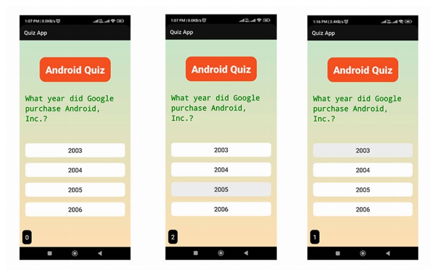
Every time an option is clicked, we get the value of its corresponding android:tag attribute. We increase the score by 2 if it is Correct and decrease it by 1 if it is Wrong.
You can now install the app on your android devices and click on the correct option to see the updated score.


Final Thoughts
Over the course of this tutorial you’ve learned the essentials of Android UI design and created a simple, but effective UI that has some working functionality to boot! Try applying some of these techniques to your own Android projects, to ensure your UI doesn’t let your app down.
如有侵权请联系:admin#unsafe.sh