2023-10-31 03:20:43 Author: blogs.sap.com(查看原文) 阅读量:7 收藏
For quite some time, I have been exploring data processing techniques -EDA (Exploratory Data Processing) which happens in AI/ML scenarios. And when it comes to EDA , you will definitely encounter Pandas dataframe which is a python package efficient in data analysis and manipulation. This works very well when dealing with two dimensional data structure.
On the other hand from a Successfactors(SF) consultant perspective —-most of the analysis happens on the csv file which we download very frequently on various objects like Employee Profile data, FO, MDF objects , etc. Csv files are nothing but two dimensional data.
So I had the data from Successfactors and Pandas dataframe for effective data analysis. I just needed something which can quickly show a consolidated overview and required minimal coding. And this is where STREAMLIT provided a wonderful option to build webpages.Streamlit is an open source framework to create webapps very quickly.
I tried combining the best of both the worlds to come up with a simple dashboard for some of the frequent analysis that happens in Successfactors.
Just as an example for this blog, I wrote some simple scripts to analyse the Employee Profile data. For this example –I used a csv file downloaded from SF as a source. For real time analysis—we can have python script read the User APIs and populate the dashboard with the response from the API.

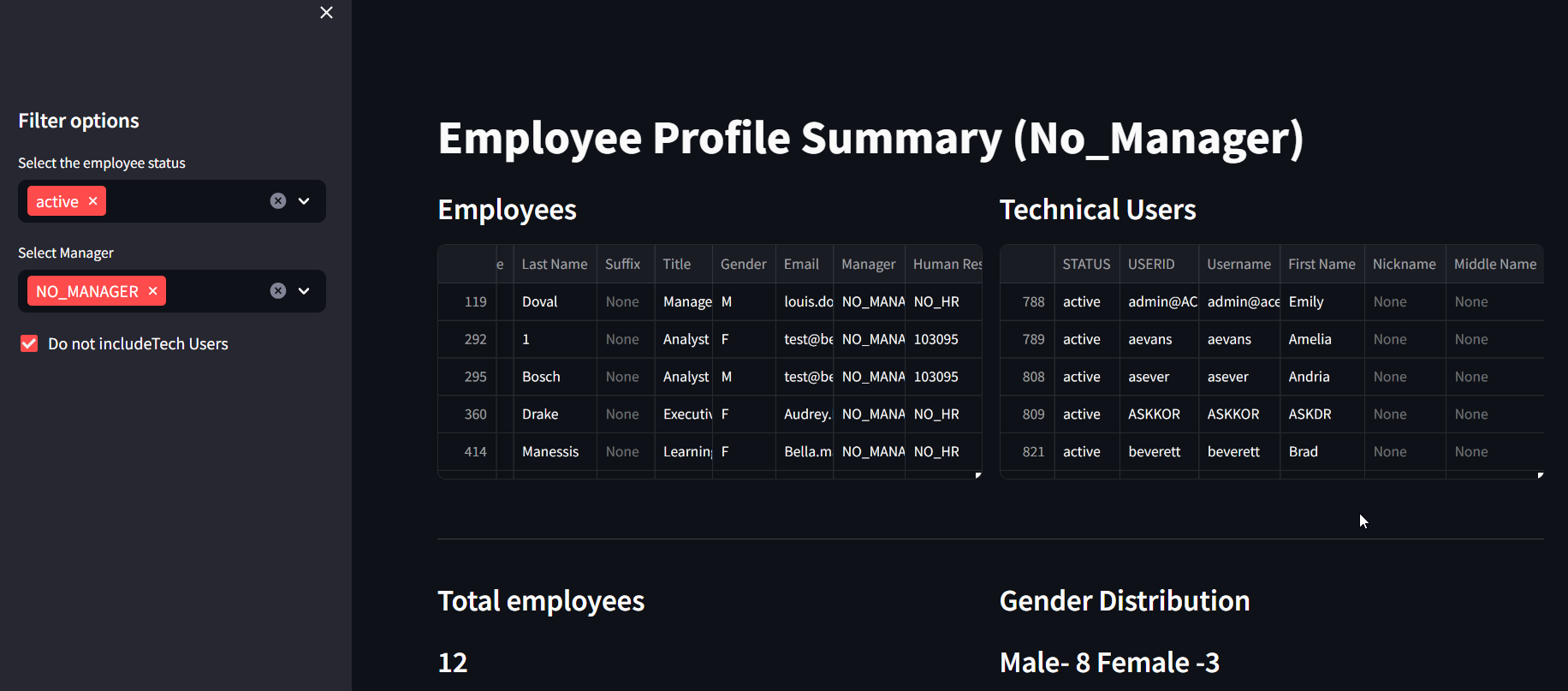
Dashboard_view1

dashboard_view2
- IDE for writing simple Python scripts
- Google Collab —always my preference as a beginner .Very simple to use
- Ngrok –optional
- Streamlit deploys the webpage in localhost and if you want to expose it as a public URL to be shared with your colleagues —you can use ngrok
Import the required libraries and start analysis of dataframes with simple query commands.
To explain the advantage of dataframes in very simple terms–Dataframes behaves more like a SQL structure– there is no need of looping through the records. Instead we can directly apply queries to the dataframe once the data is loaded.
Kindly note that the below code is for a very simple usecase wherein EP data is being checked for technical users/employees data, country and gender distribution with status as filter conditions .
With Streamlit package its very easy to build up simple webpages with minimal coding.
%%writefile dash1.py

##Import libraries
import pandas as pd
import streamlit as st
import plotly.express as pl

# Set title for the page
st.set_page_config(page_title = "Employee Profile Summary",
                  layout = "wide")
# define function to read csv data. Activate the cache so that data is stored in cache
@st.cache_data
def get_csv_data() :
  dash_df = pd.read_csv('/content/UserDirectory_SFPART050743_34594.csv',encoding = 'iso-8859-1',skiprows=1)
  return dash_df

#Set the title
st.title("Employee Profile Summary (No_Manager)")

#fill the dataframe with csv data
dash_df = get_csv_data()

#Configure the side bar with filter options
st.sidebar.header("Filter options")
#st.sidebar.checkbox("Include Tech Users")
eeStatus = st.sidebar.multiselect("Select the employee status",options=dash_df["STATUS"].unique()
                                  )
eeManager = st.sidebar.multiselect("Select Manager",options=dash_df["Manager"].unique(),
                                      default = 'NO_MANAGER')

#Set the query parameters as per the filter conditions
dash_selection = dash_df.query("STATUS == @eeStatus & Manager == @eeManager")

#Set 2 blocks
left_coldf,right_coldf =st.columns(2)

#Tech users not to be included, remove the tech users from Employee block and display the tech users alone in a seaprate block
if st.sidebar.checkbox("Do not includeTech Users"):
  dash_selection_wotech = dash_selection[dash_selection['USERID'].str.contains('[a-zA-Z]')]
  dash_selection = dash_selection[~dash_selection['USERID'].str.contains('[a-zA-Z]')]

  with left_coldf:
    st.subheader("Employees")
    st.dataframe( dash_selection,height=220)
  with right_coldf:
    st.subheader("Technical Users")
    st.dataframe( dash_selection_wotech,height=220)
else:
  with left_coldf:
    st.subheader("Employees")
    st.dataframe(dash_selection,height=220)
st.markdown("---")

#Fill dashboard values with summary of counts
total_ee = len(dash_selection)
gender_dist = dash_selection.groupby(['Gender'])['Gender'].count()
female_ee = dash_selection['Gender'].tolist().count('F')
male_ee = dash_selection['Gender'].tolist().count('M')

label_countries = dash_selection['Country'].value_counts().index
label_count = dash_selection['Country'].value_counts().values


left_col,right_col =st.columns(2)

with left_col:
  st.subheader("Total employees")
  st.subheader(f"{total_ee}")


with right_col:
  st.subheader("Gender Distribution")
  st.subheader(f"Male- {male_ee} Female -{female_ee}")


st.markdown("---")

##Pie chart for country wise distribution  of employees
fig = pl.pie(values=label_count, names=label_countries)
fig.update_layout(
    autosize=False,
    width=1000,
    height=500
)
st.header("Distribution as per Country")
st.plotly_chart(fig)
You can then execute the streamlit command and access the dasboard. You can get more details on the REFERENCES section below on how to execute the streamlit commands.
If the need is to have a full blown Web application—SAP BTP also provides the option of deploying such applications in its ecosystem.
- Easily compare 2 csv files
- Very useful when customers are migrating from Talent hybrid model to core hybrid model. In this case, EP data has to be constantly checked with the previous version during migration to ensure correctness of the data
- Data Explorer for FO and MDF objects
- Data inspector of SF does offer something similar but with the above options, we can have a flexible dashboard app
- Quick analysis of Data Models
- Parse the XML data of data models to get an consolidated overview of the custom fields, the business rules called in onInit , onSave,etc.,
The main objective of such dashboards are to provide effective utility tools in the hands of the consultants to get a quick consolidated overview of the system at any point of time.
Build machine learning apps quickly and easily with SAP BTP, Kyma and streamlit
Turn An Excel Sheet Into An Interactive Dashboard Using Python (Streamlit)
如有侵权请联系:admin#unsafe.sh