After a while it is time to start a new blog about my KPI-Dashboard. If you don’t know my Lumira-Blog, feel free to take a look: SDN
The reason of this blog is to give you an idea what is possible with our power couple SAP Analytics Cloud and SAP Datasphere. This dashboard covers the topics:
- SAC Story
- SAC Composites
- Mobile-Support
- SAC Planning
- Datasphere Integration with Catalog and Marketplace
Video:
The main concept of my dashboard is to show the data from a highly aggregated KPI to a very detailed level in one dashboard and in one system.
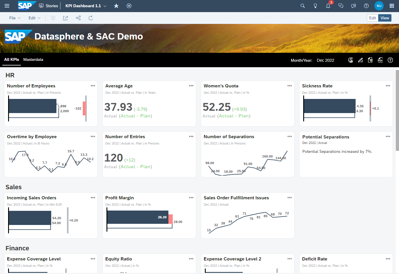
Overview
The Overview gives you highly aggregated view for your top KPIs. The most KPIs consists of a header, time selection, a unit and the actual-, plan- und delta-values. Represented as a bar-chart, numeric-chart, line-chart or a text-widget.

Overview
All master data and transactional data is stored in our SAP Datasphere. At the top of the story you find a toolbar for switching the tabs, a month selection and buttons to open the usage-story, the to open the planning story, export to excel and pdf and a link to the SAP Datasphere Catalog as the central point for documentation.

Toolbar
The tiles and the corresponding headers (HR, Sales, Finance…) are parts of a flow layout panel. But every single tile is also a flow layout panel:

Tile
So why the flow layout panel? With the flow layout panel, you have the choice to hide objects at runtime if the screen size is too small. Panel_70 is the divider to the prior KPI. But in the mobile context we list all KPIs, so that’s the reason why we want to hide the divider.

Tile – Hide Panel
Details
If the user clicks on the button with the three dots it opens a detail-screen.
The details-screen consists of three areas:
- Header for the description, actual, plan and delta
- A time series chart for actual and plan
- A detailed chart for the specific KPI
The details-screen is very generic, the most elements are filled at runtime via script. All transactional data and master data like the description are stored in SAP Datasphere.

Details
You can compare a kpi to another one by selecting the corresponding kpi in the drop-down box:

Compare – Selection
After selecting the KPI the sime series switches to a line chart with an additional axis:

Compare
The switch is needed because the time series is not supporting a second y-axis. The relationships are customizable via script for the details-screen. So, let’s have a look into the script which opens the detail-screen:
Application.showBusyIndicator();

if ( TBL_MASTERDATA.getDataSource().isRefreshPaused() === true){
	TBL_MASTERDATA.getDataSource().setRefreshPaused(PauseMode.Auto);
}

var kpi_name = "";
var kpi_description = "";
var kpi_value_actual = "";
var kpi_value_plan = "";
var kpi_value_difference = "";
//var ds = ip_DataSource;
//var masterdata = TBL_MASTERDATA.getDataSource();
var masterdataResultSet = TBL_MASTERDATA.getDataSource().getResultSet({"_V_MD_KPI∞0": ip_Key_KPI});
var unit = masterdataResultSet[0]["Unit"].id;
var deltaUnit = masterdataResultSet[0]["Delta_Unit"].id;
var condFormatting = masterdataResultSet[0]["Conditional_Formatting"].id;
var decimalPlaces = masterdataResultSet[0]["Decimal_Places"].id;

kpi_name = masterdataResultSet[0]["_V_MD_KPI∞0"].description;

// müsste vor das auslesen des Resultsets gesetzt werden... aber das resultset brauchen wir zum auslesen der decimal places
//TBL_MASTERDATA.getNumberFormat().setDecimalPlaces(ConvertUtils.stringToInteger(decimalPlaces),["Actual","Plan","Delta_PL"]);
var actual = masterdataResultSet[0][Alias.MeasureDimension].formattedValue;
var string_length = actual.length;
if (decimalPlaces === "0"){
	actual = actual.substr(0,string_length-3);
} else if (decimalPlaces === "1"){
	actual = actual.substr(0,string_length-1);
}
kpi_value_actual = actual + " " + unit;

var plan = masterdataResultSet[1][Alias.MeasureDimension].formattedValue;
string_length = plan.length;
if (decimalPlaces === "0"){
	plan = plan.substr(0,string_length-3);
} else if (decimalPlaces === "1"){
	plan = plan.substr(0,string_length-1);
}
kpi_value_plan = plan + " " + unit;

kpi_description = "Description: " + masterdataResultSet[0]["Description"].id;

var delta = masterdataResultSet[2][Alias.MeasureDimension].formattedValue;
string_length = delta.length;
if (decimalPlaces === "0"){
	delta = delta.substr(0,string_length-3);
} else if (decimalPlaces === "1"){
	delta = delta.substr(0,string_length-1);
}
var valueDelta = delta + " " + deltaUnit;
if (valueDelta.charAt(0) !== "-"){
	valueDelta = "+" + valueDelta;
}

kpi_value_difference = valueDelta;

if (condFormatting === "grey"){
	if (gv_isMobile === true){
		TXT_DETAILS_KPI_VALUE_DIFFERENCE.setCssClass("kpi_grey:mobile");
	} else {
		TXT_DETAILS_KPI_VALUE_DIFFERENCE.setCssClass("kpi_grey");
	}
} else if (condFormatting === "green" && valueDelta.charAt(0) === "+"){
	if (gv_isMobile === true){
		TXT_DETAILS_KPI_VALUE_DIFFERENCE.setCssClass("kpi_ok_mobile");
	} else {
		TXT_DETAILS_KPI_VALUE_DIFFERENCE.setCssClass("kpi_ok");
	}
} else if (condFormatting === "green" && valueDelta.charAt(0) === "-"){
	if (gv_isMobile === true){
		TXT_DETAILS_KPI_VALUE_DIFFERENCE.setCssClass("kpi_warning_mobile");
	} else {
		TXT_DETAILS_KPI_VALUE_DIFFERENCE.setCssClass("kpi_warning");
	}
} else if (condFormatting === "red" && valueDelta.charAt(0) === "+"){
	if (gv_isMobile === true){
		TXT_DETAILS_KPI_VALUE_DIFFERENCE.setCssClass("kpi_warning_mobile");
	} else {
		TXT_DETAILS_KPI_VALUE_DIFFERENCE.setCssClass("kpi_warning");
	}
} else if (condFormatting === "red" && valueDelta.charAt(0) === "-"){
	if (gv_isMobile === true){
		TXT_DETAILS_KPI_VALUE_DIFFERENCE.setCssClass("kpi_ok_mobile");
	} else {
		TXT_DETAILS_KPI_VALUE_DIFFERENCE.setCssClass("kpi_ok");
	}
}

CHT_DETAILS_TIME_SERIES.getDataSource().setDimensionFilter("_V_MD_KPI∞0", ip_Key_KPI);

TXT_DETAILS_KPI_DESCRIPTION.applyText(kpi_description);
TXT_DETAILS_KPI_NAME.applyText(kpi_name);
TXT_DETAILS_KPI_VALUE_ACTUAL.applyText(kpi_value_actual);
TXT_DETAILS_KPI_VALUE_PLAN.applyText(kpi_value_plan);
TXT_DETAILS_KPI_VALUE_DIFFERENCE.applyText(kpi_value_difference);

PNL_DETAILS_CONTENT_BODY_STAFF_DEPARTMENT.setVisible(false);
PNL_DETAILS_CONTENT_BODY_STAFF_AGE.setVisible(false);
PNL_DETAILS_CONTENT_BODY_BUILDINGS.setVisible(false);
PNL_DETAILS_CONTENT_BODY_TRUCKS_INBOUND.setVisible(false);
PNL_DETAILS_CONTENT_BODY_TRUCKS_INTIME.setVisible(false);

Panel_9.setVisible(false);

if (ip_Key_KPI === "1001" || ip_Key_KPI === "1005" || ip_Key_KPI === "4001" || ip_Key_KPI === "7001" || ip_Key_KPI === "7002"){
	//	PNL_DETAILS_CONTENT_BODY_TIME_SERIES.getLayout().setWidth(LayoutValue.create(49, LayoutUnit.Percent));
	//	PNL_DETAILS_CONTENT_BODY_TIME_SERIES.getLayout().setLeft(10);
	//	PNL_DETAILS_CONTENT_BODY_TIME_SERIES.getLayout().setRight(LayoutValue.create(0, LayoutUnit.Auto));
	Panel_9.setVisible(true);
	Panel_1.getLayout().setWidth(LayoutValue.create(50, LayoutUnit.Percent));
} else {
	// no details, fullscreen time series
	Panel_1.getLayout().setWidth(LayoutValue.create(100, LayoutUnit.Percent));
}

var compareKPIs = [["","",""]];
compareKPIs.pop();
compareKPIs.push(["1001","Number of Employees", "28122784-7412-4618-3955-288871600133"]);
compareKPIs.push(["1002","Number of Entries", "15976099-2438-4402-3561-125568796053"]);
compareKPIs.push(["1006","Overtime by Employee", "10898370-8422-4806-3781-184669621010"]);
compareKPIs.push(["1005","Average Age", "64048119-9715-4102-3302-623282230169"]);
compareKPIs.push(["1009","Women's Quota", "96379570-8179-4788-3757-204761531642"]);
compareKPIs.push(["1000","Sickness Rate", "16520085-1740-4256-3846-939884980273"]);
compareKPIs.push(["1003","Number of Separations", "29834580-8222-4486-3173-915719655792"]);
compareKPIs.push(["1010","Potential Separations", "11539133-8928-4619-3874-417978403661"]);
compareKPIs.push(["6000","Incoming Sales Orders", "25883988-1436-4498-3322-134722143097"]);
compareKPIs.push(["7001","Trucks", "21569605-0639-4846-3227-393539252098"]);
compareKPIs.push(["7002","Trucks on time", "14453629-1536-4242-3024-559811062329"]);
compareKPIs.push(["7011","Picks", "10261043-3491-4300-3712-374623788822"]);

CHT_DETAILS_COMPARE.setVisible(false);
CHT_DETAILS_TIME_SERIES.setVisible(true);
Dropdown_2.setVisible(false);

if (ip_Key_KPI === "1000"){
	SO_FUNCTIONS.initializeCompareMode(ip_Key_KPI,["1001","1002", "1006", "1005", "1009", "1003", "1010", "6000", "7011"]);
} else if (ip_Key_KPI === "1001"){
	PNL_DETAILS_CONTENT_BODY_STAFF_DEPARTMENT.setVisible(true);
	SO_FUNCTIONS.initializeCompareMode(ip_Key_KPI,["1002", "1006", "1005", "1009", "1000", "1003", "1010", "6000", "7011"]);
}  else if (ip_Key_KPI === "1005"){
	PNL_DETAILS_CONTENT_BODY_STAFF_AGE.setVisible(true);
	SO_FUNCTIONS.initializeCompareMode(ip_Key_KPI,["1001", "1002", "1006", "1009", "1000", "1003", "1010", "6000", "7011"]);
} else if (ip_Key_KPI === "1009"){
	SO_FUNCTIONS.initializeCompareMode(ip_Key_KPI,["1001", "1002", "1006","1005", "1000", "1003", "1010", "6000", "7011"]);
} else if (ip_Key_KPI === "4001"){
	PNL_DETAILS_CONTENT_BODY_BUILDINGS.setVisible(true);
} else if (ip_Key_KPI === "7001"){
	PNL_DETAILS_CONTENT_BODY_TRUCKS_INBOUND.setVisible(true);
	SO_FUNCTIONS.initializeCompareMode(ip_Key_KPI,["7002", "7011", "1001", "1003", "6000"]);
} else if (ip_Key_KPI === "7002"){
	PNL_DETAILS_CONTENT_BODY_TRUCKS_INTIME.setVisible(true);
	SO_FUNCTIONS.initializeCompareMode(ip_Key_KPI,["7001", "7011", "1001", "1003", "6000"]);
}  else if (ip_Key_KPI === "7011"){
	SO_FUNCTIONS.initializeCompareMode(ip_Key_KPI,["7001", "7002", "1000" ,"1001", "1003", "6000"]);
}

sv_TimeSeries_Subheader = "Actual vs. Plan | in " + unit;
// Funktioniert Stand 24.07.2023 nicht: > kommt Fehler im Script
// Funktioniert nur, wenn das Chart auf always refresh steht. Active Widgets Only führt zum Script-Fehler.
CHT_DETAILS_TIME_SERIES.getNumberFormat().setDecimalPlaces(ConvertUtils.stringToInteger(decimalPlaces),["Actual","Plan"]);


PNL_DETAILS.setVisible(true);

Application.hideBusyIndicator();- Lines 3-5: Load Datasource if it’s not loaded already.
- Line 14: Read the resultset
- Lines 15-20: Get masterdata for the kpi
- Lines 24-56: Set the values for actual, plan and delta by respecting the decimals places.
- Lines 58-88: Set the conditional formatting of the delta-values. In Datasphere there is an attribute for that. If its set to green it means, that if the actual is higher than the plan it is good. If the value is red it means, that if the actual is higher than the plan it is red. Example: If the sickness rate is higher than plan it is not good, but if the revenue is higher than the plan it is good. If the value is set to grey no conditional formatting is needed/valid for the KPI. For the mobile-css classes I used the font-size 4vw and for desktop 32px.
- Lines 117-156: Sets the compare-kpis. All compare-kpis are restricted measures in the compare chart. So, the id, for example “28122784-7412-4618-3955-288871600133” is automated generated by SAC. Additionally the relevant detail-area bottom-right is getting visible for the specific KPI.
If the user needs more detail about the data, the user can open the Data Analyzer:

Open Data Analyzer
In the Data Analyzer has the user the maximum flexibility to analyze the data in a more detail level.

Data Analyzer
Composites

Composite for selection of month/year
I used the newly released composite feature to create a month picker. The month picker allows the user to switch the year and the month.
If we have a look into the widget itself, we see the structure of it:

Composite – Design time
We see that it consists of buttons and some scripting. If the user clicks on OK or Cancel it fires a the event “cancel” or “submit”:
Composite.fireEvent("cancel");There are some getter und setter-interface-functions, but not all are already implemented at the moment. Important are only:
- getCalMonth: to get the selected value as key.
- getCalMonthTxt: to get the selected value as text.
- setCalMonth: to set the initial selection.
- setCSSClass: to set the css class of the buttons.
To use CSS is possible in the current phase of composites. But you can’t use CSS-classes in the styling panel, but you can use css-classes via script. The css-classes must implemented in the story which consumed the composite because there is no css-area in the composite itself.
If a month-button is clicked by the user it fires the script “SO_DP>setMonth”:
var buttons = [BTN_DP_MONTH_01, BTN_DP_MONTH_02, BTN_DP_MONTH_03, BTN_DP_MONTH_04, BTN_DP_MONTH_05, BTN_DP_MONTH_06, BTN_DP_MONTH_07,
			  BTN_DP_MONTH_08, BTN_DP_MONTH_09, BTN_DP_MONTH_10, BTN_DP_MONTH_11, BTN_DP_MONTH_12];

for (var i = 0; i < buttons.length; i++){
	buttons[i].setCssClass("");
}

if (button === BTN_DP_MONTH_01){
	SV_DP_selectedMonth = '01';
}
else if (button === BTN_DP_MONTH_02){
	SV_DP_selectedMonth = '02';
}
else if (button === BTN_DP_MONTH_03){
	SV_DP_selectedMonth = '03';
}
else if (button === BTN_DP_MONTH_04){
	SV_DP_selectedMonth = '04';
}
else if (button === BTN_DP_MONTH_05){
	SV_DP_selectedMonth = '05';
}
else if (button === BTN_DP_MONTH_06){
	SV_DP_selectedMonth = '06';
}
else if (button === BTN_DP_MONTH_07){
	SV_DP_selectedMonth = '07';
}
else if (button === BTN_DP_MONTH_08){
	SV_DP_selectedMonth = '08';
}
else if (button === BTN_DP_MONTH_09){
	SV_DP_selectedMonth = '09';
}
else if (button === BTN_DP_MONTH_10){
	SV_DP_selectedMonth = '10';
}
else if (button === BTN_DP_MONTH_11){
	SV_DP_selectedMonth = '11';
}
else if (button === BTN_DP_MONTH_12){
	SV_DP_selectedMonth = '12';
}

button.setCssClass("btn_pressed");
What happens in the script:
- Lines 1-6: reset css-class of every button.
- Lines 8-43: save the month in a global script variable.
- Line 45: Set the the css-class of the pressed button.
From the consumption perspective we have a button to open the month selection:

Composite – Integration
The button calls the following script:
Composite_21.setCSS();
Composite_21.setCalMonth(sv_timeSelection);
Composite_21.setVisible(true);
What happens:
- All CSS-Classes are deleted so no button is clicked anymore
- The initial time selection takes place and the corresponding year is selected and the corresponding month-button is “clicked” by setting the CSS-Class.
- The Composite gets visible
Mobile Support
There is no additional story for the mobile use case. It is all the same app, build with canvas. Here are some sreenshots of the iOS-App:

Mobile – Overview
Using the flow layout panel, all KPIs are displayed one below the other and without spaces on the left and right side.
The SAP-logo gets hidden on the mobile use case. The flow layout was also used here to hide the logo. But there is some scripting needed, because not all topics are solved by the flow layout panel. In the “onInitialization” and “onResize” I implemented the following script:
if (Application.getInnerWidth().value < 850){
	SO_FUNCTIONS.setDetailsMax(true);
} else {
	SO_FUNCTIONS.setDetailsMax(false);
}
if(Application.getInnerWidth().value < 750) {
	SO_FUNCTIONS.setMobile(true);
	gv_isMobile = true;
} else {
	SO_FUNCTIONS.setMobile(false);
	gv_isMobile = false;
}
If the width of the window is less than 850 we fullscreen the details-screen, so no borders are displayed anymore. If the window width is less than 750px we are switching to mobile. But only some layout stuff like optimize the header on the details-screen and setting some borders.

Mobile – Details
If you scroll down, you see the 2nd Chart.

Mobile – Details 2nd Chart
Composites are also working in mobile scenarios:

Mobile – Composite
I use SAC Planning to give the user to maintain the plan data for the dashboard. It is a simple layout:

SAC Planning
I know that is not a real-life planning scenario, but it shows how SAC Reporting, SAC Planning and SAP Datasphere interacts.
In the layout there are some buttons to save the plan data, revert the data or copy the actual to plan. Additionally, there is a filter-icon to open a side panel for filtering the area and the KPIs. So, the SAC Planning Model is very simple. I used to data locks to prevent inputs for the actuals.
The data is stored in the SAC Planning Model and imported to Datasphere.
Catalog
If you click in the toolbar on the question mark you directly jump into the catalog-asset of Datasphere.

Datasphere – Catalog
Here you can describe the Dashboard-Artefact and manage the KPIs that are part of your Dashboard. Every single KPI is described by description, threshold, calculation, etc.

Datasphere – KPI
Lineage
If you open the Lineage you can see where the data is coming from and you can also see that the plan data of SAC is imported into the Datasphere.

Datasphere – Lineage
如有侵权请联系:admin#unsafe.sh