2024-9-6 08:1:13 Author: hackernoon.com(查看原文) 阅读量:1 收藏
Soooo!
Recently, I had a client for whom I had to make a landing page (will talk about this in another blog).
Something that I always hated the most was picking a font for a website. I have even watched hours of video on typography, and still find it difficult to pick a font. Oh! Believe me when I say the font types you choose make a lot of difference and in a way, it adds personality to a page. It can take your page from 🤮 to 🤯.
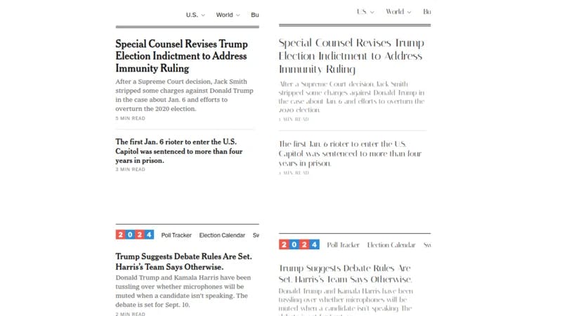
For example, let’s test 2 different fonts on the NYT (New York Times) page.

The one on the left is NYT’s default “Cheltenham” and “Georgia.” The one on the right is “Italiana.” Guess which is more readable? Which page will you stay longer?
Or
Look at some of the websites on Awwwards; you’ll always notice almost all of them have great typography that goes with the page.
Coming Up With the Idea

Now, testing different fonts on a website would take a lot of time; it’s also due to the fact that most of us don’t have a quick preview of the font on our website. (especially when coding it yourself)
This is when I realized having a quick preview of the fonts directly on the webpage would save me hours of guessworking.
I wanted to preview Google fonts (my primary source for fonts) on any website and copy the code directly. The only way to achieve this was by making a browser extension.
So, I took a week off and started building a tool called Font tester and open-sourced it so anyone who’s building an extension can take reference.
Why I Started With A Chrome Extension

Well to no one’s surprise, I decided to start with the Chrome extension because of its market dominance. Chrome has a market share of 65.41% followed by Safari — 18.39% and Edge with 5.24%. (source)
Despite my primary browser being Edge, I decided to make the extension for Chrome so many more people could use the extension. Now, don’t get me wrong, I still use Chrome, but sometimes, it takes up huge chunk of my computers memory.
Plus, porting an extension made for Chrome to Edge or chromium based browsers isn’t that difficult.
Now, when you start going through the developer guide by Google, you’ll see that there are multiple ways to show your extension.
I’ll be focusing on the Popup and injecting the widget to the page.
The popup is the one that popups as shown below.
It runs in an isolated container, has a separate DOM and JS context.
Now, while this might be ideal for most use cases, I didn’t want the extension to be in one place. I wanted to allow people to move the widget around on the page, so its easier to use and less annoying
This is why I chose to inject the widget directly into the webpage, so it looks something like show below.

Using Vanilla JS VS Library
I started developing this in plain Js, but quickly realised that using this approach, it would take me more time to develop the prototype, so I decided to use React.js.
Setting up things initially with React.js for extension took me sometime (mostly because I couldn’t find much documentation with React+chrome extension), However, I was able to move faster during the development phase.
I also decided to choose a component library antd, so I won’t have to reinvent the wheel and can prototype at a faster phase.
So, if you are using React + Webpack setup for your extension, feel free to take reference from Github.
ShadowDOM 🦇

So, one of the major problems of injecting your extension to different webpage is that the webpage styling could affect how your extension’s look.
This is when I came across a ShadowDOM. This was a totally new concept to me; I had never heard of this before.
So essentially, any styling or JS on the page won’t affect your extension’s styling if you add it inside ShadowDOM.
So, once I understood what it was, I rewrote parts of my code to attach to shadowDOM instead of the webpage’s DOM. This way, the widget’s styling wasn’t affected by the page’s styling.
Publishing to Chrome Store.
Finally, after testing, it was time to publish the extension to the Chrome store.
Publishing to Chrome Store is a bit different; it has a number of security questions set in place to ensure you are not publishing a malware. After publishing, I felt publishing to Chrome had higher security standards than publishing to Play Store, for good reasons.
Now, depending on the permissions in your manifest.json., you'll have to justify why you need the permission in their form.
The review process can vary between few hours to week. My first review took around 2 days, which is when I noticed that the styles were not being applied in the widget.
So, I had to rebuild it along with the styles, and resubmit it before publishing; this time, it took less than 24 hrs and finally, I published my first chrome extension 😎

And that’s how writing my first chrome extension went.
About Me
For those who don’t know me, I am Paul, I write open-source most of the time.
If you want to see more open-source you can follow me on GitHub and Twitter
Oh! And don’t forget to check out the extension, and let me know your feedback 🙃.
Thank you for reading!
Please keep this CTA when you submit]:
Would you like to take a stab at answering some of these questions? The link for the template is
如有侵权请联系:admin#unsafe.sh
