
As a front-end developer, you must have heard of Vercel. It’s famous in the developer community for simplifying hosting and deployment. Vercel is about optimizing the frontend experience, speeding up workflows, reducing deployment times, and simplifying continuous integration.
Then came Vercel
v0 is not just about speed. It generates React code that is compatible with Shadcn UI and Tailwind CSS, making it perfect for developers who want to build modern, beautiful UIs. But, as great as it is, many developers are still thinking:
- What about the design-to-code process?
- Where’s the flexibility?
- The customization?
That’s where a new open-source tool,
Let’s explore how Webcrumbs is leading the way.
The Rise of AI in Web Development
AI is everywhere, including web development. Recently we’ve seen many AI-powered tools designed to make coding faster, smarter, and more efficient. From auto-completing lines of code to generating entire project setups, AI is no longer just an idea, it’s changing how developers work today.
When Vercel v0 came out, it was nearly perfect. It excited developers by automating tasks that used to be manual and slow. Deploying React code that worked perfectly with Shadcn UI and Tailwind CSS became easy. It showed how AI could smoothly fit into the frontend workflow. v0 set high standards for what AI could achieve.
But as amazing as it was, developers wanted more accuracy, customization, and flexibility. That’s where, tools like
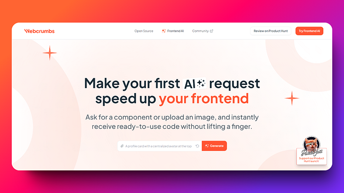
Webcrumbs: Speed up your Frontend
If Vercel v0 got developers excited about the possibilities of AI,
Webcrumbs a big step forward in front-end coding. Its mission? To make the development process faster, smarter, and much easier, while giving developers more freedom to create.
At its core, Webcrumbs uses artificial intelligence to generate code components directly from images or text descriptions. You can describe any UI element, or even upload a visual reference, and Webcrumbs instantly transforms that into React, Vue, Svelte, or even HTML.
Some of its standout features include:
-
Rapid prototyping: Quickly create and update UI components without manual coding.
-
AI-powered code generation: Turn images or descriptions into accurate code.
-
Efficiency boost: Automate repetitive coding tasks to increase your productivity.
-
Start with an Idea: Provides a template option to pick a pre-built UIs
In short, it helps you turn your ideas into working code faster and more effectively. It’s not just about speeding up development, it’s about redefining what’s possible.

Being an
But before trying things by yourself, let me show you some examples where we compare v0 and Webcrumbs Frontend AI to see how they work in real scenarios.
v0 vs Webcrumbs
Both Webcrumbs and v0 bring a lot to the table, but when it comes to feature depth and flexibility, they both take different approaches. Let’s break it down feature by feature to see how these two tools stack up.
We’ll use examples to see how accurate their results are.
UI/UX generation capabilities
When it comes to generating user interfaces, Vercel v0 stands out by providing code that works well with popular tools like Next.js, Shadcn and Tailwind CSS. It’s fast, clean, and ideal for developers who use these frameworks. You get ready-made components and layouts that help speed up the initial development phase.
Example:
Let’s see how it generates a UI for us. We will test it from scratch by creating a prompt and generating a UI.
Go to
First, we will test it with a prompt. You can also test it using this prompt.
Provide a visual reference or detailed description of an interactive data card.
Include specific styling details: a header with a title and icon, a main content area with a key metric and trend indicator, an embedded image, and action buttons in the footer.
And this is what v0 generates. It gives you 3 samples and you can enter more prompts to refine it.

Webcrumbs, on the other hand, takes it a step further. You’re not just handed pre-built UI components but, you can actually generate custom components based on visual inputs or text descriptions. Need a hero section? Just describe it, and Webcrumbs does the rest. This level of flexibility in design-to-code is where Webcrumbs stands out.
Let’s use the same prompt with Webcrumbs.

This is what Webcrumbs comes up with. You can check the above card directly via Webcrumbs share
I would say better. Why?
-
Generates a better design.
-
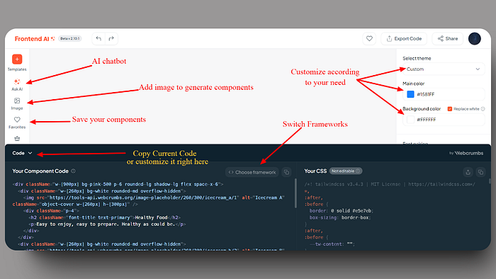
Allows editing of everything. I can customize fonts, colors, spacing, and even the code. I can also chat with an AI bot to customize my current component.
-
It let me choose different frameworks.
-
Everything is so flexible, I am not bound by any limitations
You know what’s the best part? You can modify it according to your needs.
Now, in this same category of UI/UX generation, let’s create something using an image. As front-end developers, we often receive new, interesting, and complex Figma UIs, so design-to-code will be an interesting option to test. The free version of v0 gives you one chance to use an image, while with Webcrumbs, you can use unlimited images. I am going to use this image I got from Figma. Let’s see how they both perform.

This is what v0’s first version comes up with.

I would say it’s good, but the cards are too wide. Although I can edit them, and I’m sure after refining them a few times, they will get better in look. But, now let’s see the Webcrumbs result.

You can check the above card directly via Webcrumbs share
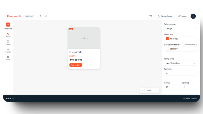
This one looks more accurate. The cards are not too wide, and the colors and spacing are closer to the reference image we provided. From the options on the right-hand side, you can even add spacing and change more elements without writing manual code.
Code Quality and Customization Options
Both tools aim to deliver high-quality code, but they do it differently. Vercel v0 creates reliable React code that works well with Shadcn components, but your customization options are limited by the templates and UI libraries it uses. You might spend time adjusting and rewriting code if you need something unique.
For example, I tried generating an e-commerce card using v0 to check the code quality. This is what it generated. It’s pretty good. The UI is also good, and the code that v0 generates is quite nice and can be used in our codebase with some modifications.

With Webcrumbs, customization is built-in from the start. It generates code based on specific visual or textual inputs, giving you more control over the final product. Plus, Webcrumbs’ AI ensures the code is clean, modular, and easy to adjust. Need to change the style or add new features? You can easily modify the output without worrying about compatibility issues.
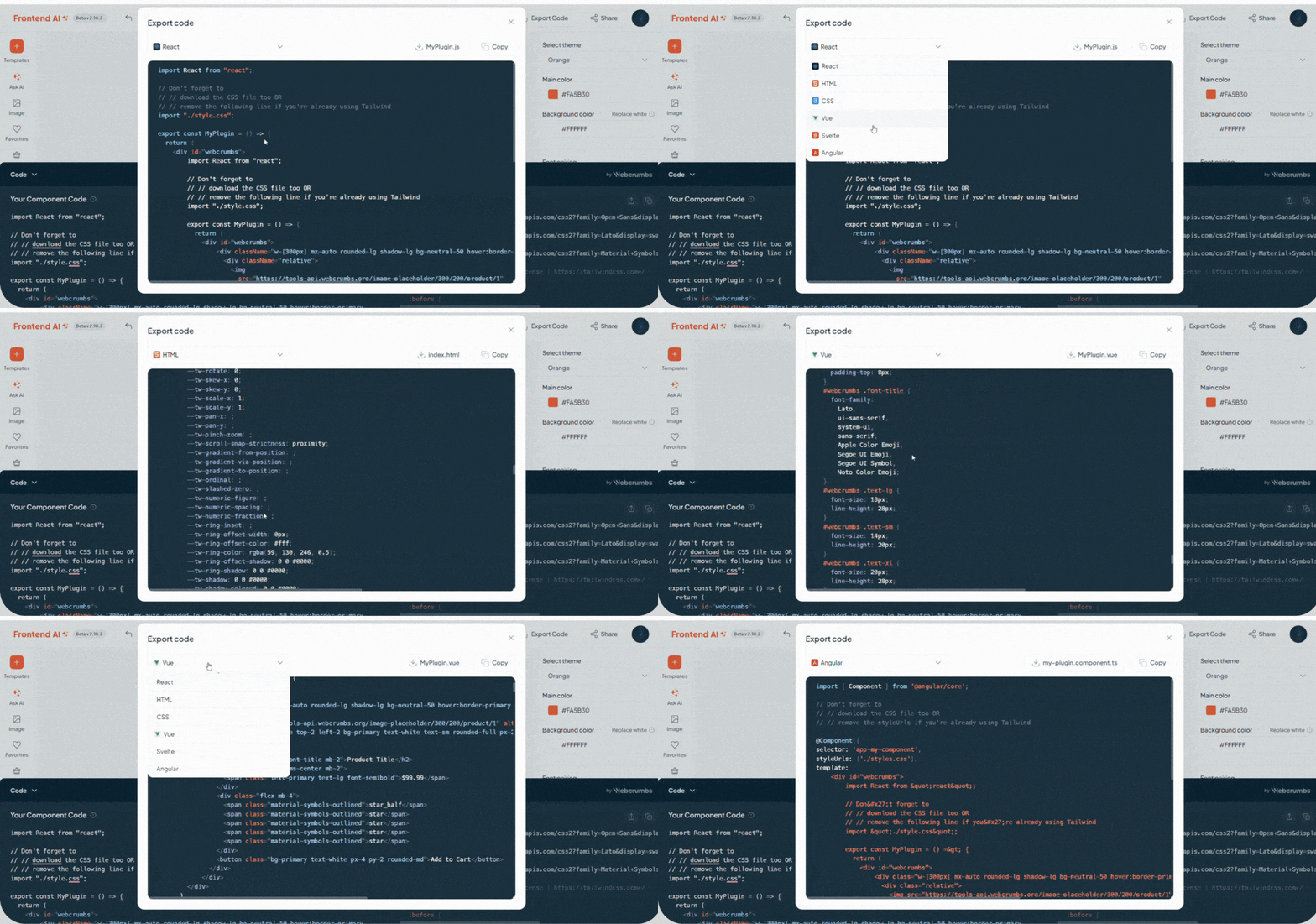
This is what Webcrumbs generates for the same prompt we used for v0. This one is also pretty good. In terms of code quality, both are excellent. You can always switch between frameworks with Webcrumbs’ frontend AI. For example, this card is in React JS (JSX), but I can convert it into Vue, Svelte, or even vanilla JavaScript.
Webcrumbs export feature👇🏼
Let’s see one last complex example. The prompt I used:
A chess board with unicode characters
The v0 result:👇

Webcrumbs Frontend AI result:👇

You can check the above card directly via Webcrumbs share
Overall, Webcrumbs is designed to fit into a wider range of workflows. Webcrumbs generates code that works with whatever tech stack you’re using. Plus, its ability to convert designs directly into code makes it a powerful tool for teams that want to cut down on manual handoffs between designers and developers. Whether you’re in a small startup or an enterprise-level team, Webcrumbs is versatile enough to adapt to your specific needs.
Addressing Common Vercel v0 Pain Points
While Vercel v0 changed deployment and workflow efficiency, it comes with some limitations, especially when making changes to the final output. For example, with v0, you’re often working within a pre-set framework like Next.js.
Webcrumbs can break through barriers because it can work with different technologies like React, Vue, Angular, Tailwind CSS, etc. This gives developers the freedom to choose what they want to use.
Another common frustration with Vercel v0 is that while it speeds up the deployment process, it doesn’t help much with the design-to-code workflow. With Webcrumbs, that problem is solved. You can upload an image of a UI component like, a card or a navigation bar, and Webcrumbs will generate a fully responsive, accessible component that looks perfect compared to the original. No more tweaking or manually adjusting every element. It just works, right out of the box.
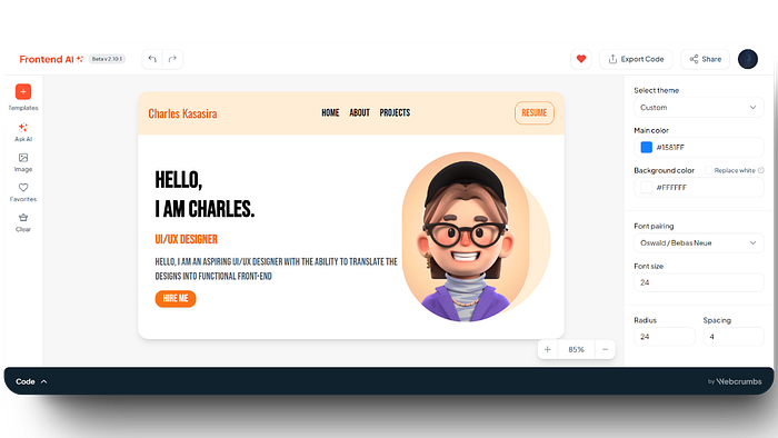
You can check the above card directly via Webcrumbs share
When to Choose Webcrumbs Frontend AI
Webcrumbs Frontend AI is perfect for situations where you need more than just an AI tool. It’s great for projects that require a lot of customization and flexibility. Here are some types of projects where Webcrumbs works best:
- Rapid Prototyping: For startups and teams that need to move fast, Webcrumbs makes rapid prototyping easy without manual coding. You can quickly turn a concept into a working prototype, making it simpler to test and improve your ideas.
- Multi-Framework Projects: If your project involves working across different frameworks or technologies, Webcrumbs is versatile enough to handle it. Whether you’re using React, Vue, or Angular, it adapts to your tech stack, giving you consistent results regardless of your chosen framework.
- On Point Component Creation: Webcrumbs best when instructing it for a specific task. For example, if you need a form in your component, instead of asking it to create an entire page, just tell Webcrumbs Frontend AI exactly what you need in that form. This way, it knows which component to focus on and build. This approach gives better results.
Conclusion
Webcrumbs Frontend AI and Vercel v0 both offer great features, but they serve different purposes. Vercel v0 is great for fast deployments and easy setup with popular frameworks, making it a top choice for projects where speed and simplicity are most important. On the other hand, Webcrumbs offers customization, flexibility, and design-to-code automation, making it perfect for projects that need a high level of personalization and adaptability.
Choosing the right tool depends on your project requirements. If you need rapid deployment with predefined components, Vercel v0 is a great choice. But, if your project demands design details, versatility across frameworks, and a tool that can bridge the gap between design and development seamlessly, Webcrumbs Frontend AI is worth a try.
If you’re seeing Webcrumbs for the 1st time, you might want to explore their
如有侵权请联系:admin#unsafe.sh