
Flamescope is a new open source performance visualization tool that uses subsecond offset heat maps and flame graphs to analyze periodic activity, variance, and perturbations. We posted this on the Netflix TechBlog, Netflix FlameScope, and the tool is on github. While flame graphs are well understood, subsecond offset heat maps are not (they are another visualization I invented a while ago). FlameScope should help adoption.
In summary: the x-axis are columns of whole seconds, and the y-axis is the fraction within each second, grouped as buckets (boxes). The box color scales to show the number of events that happened at that second and subsecond: darker is more. Here's a real subsecond offset heat map of CPU samples:
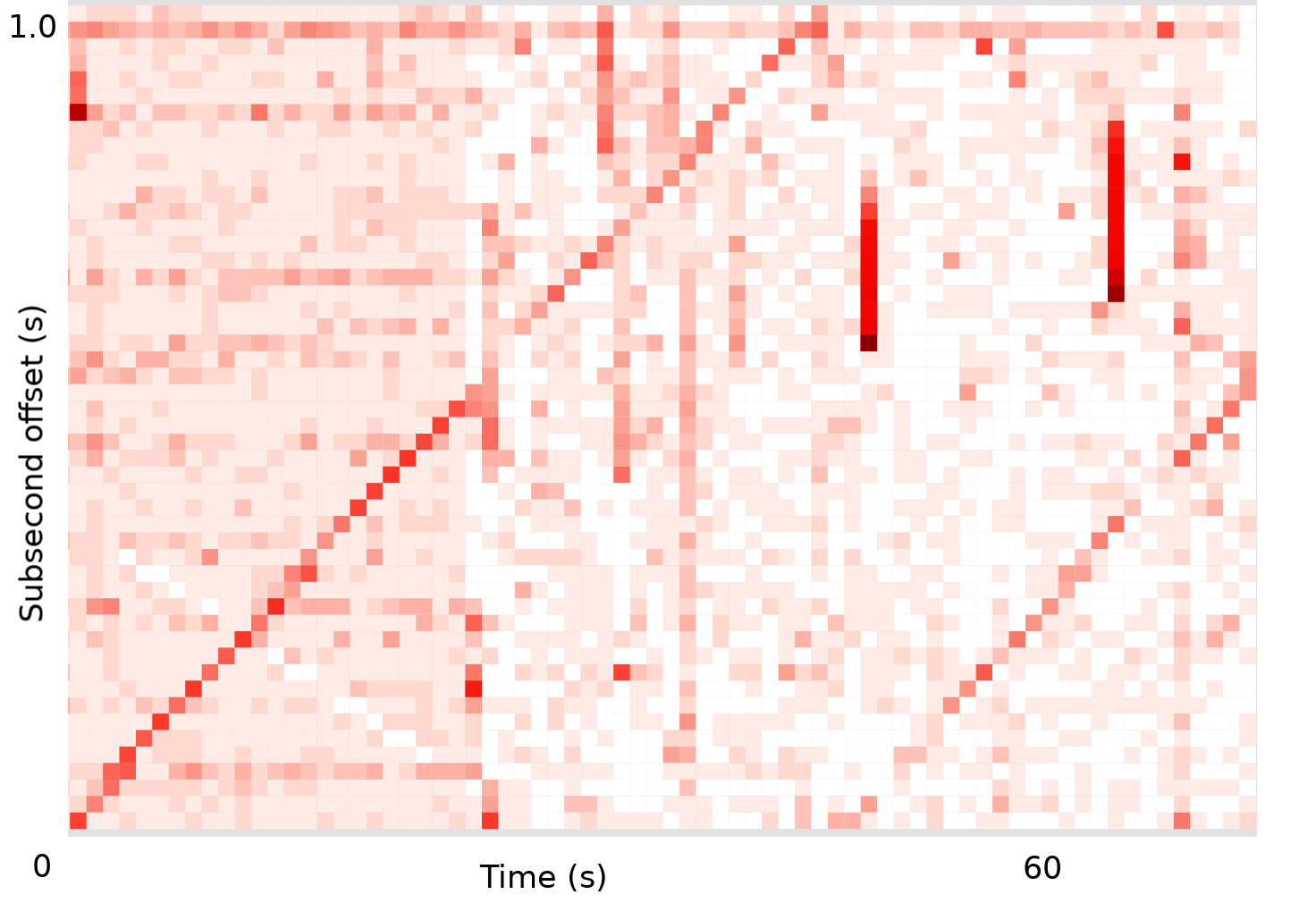
What can you identify in this? In this post I'll draw some synthetic subsecond offset heat maps for CPU samples, so I can separate out and show you patterns. In the real flame scope tool, these patterns can be selected and a flame graph generated, to show the responsible code paths (I'm not demonstrating flame graphs here).
Periodic Activity
1. One thread, once per second

A thread wakes up at the same offset each second, done a few milliseconds of work, then goes back to sleep.
2. One thread, twice per second

The wakeups are exactly 500 ms apart. It could be two threads, but chances are it's one, given the 500 ms offset.
3. Two threads
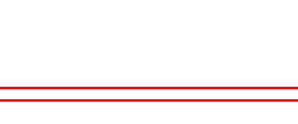
This looks like two threads waking up once per second.
4. One busy-wait thread, once per second

This thread does about 20 ms of work, then sleeps for a whole second (1000 ms). It's a common pattern, and results in the wakeup offset creeping forward each second.
5. One busy-wait thread, twice per second

The wakeups are now 500 ms apart. Chances are it's one thread, twice per second.
6. One heavy-busy-wait thread

The slope is higher, as it's doing more work per second, looks like about 80 ms.
7. One less-busy-wait thread
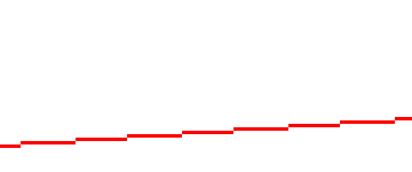
The slope is less, as it's doing less work per second, probably a few milliseconds.
8. One busy-wait thread, once every five seconds
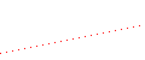
Now it's only waking up once every 5 seconds.
If you're already wondering, I think we can calculate the CPU busy time on each wakeup based on the angle and the spacing between wakeups:
-
busy_time = (1000ms / (heatmap_rows x spacing)) x tan(angle)
So my earlier 45 degree line would be:
-
busy_time = (1000ms / (50 x 1)) x tan(45) = 20ms
Variance
9. CPUs 100% utilized

What it would look like if you maxed out all CPUs perfectly.
10. CPUs 50% utilized

Real world workloads look more like this. It's composed of short requests, random arrivals.
11. CPUs 25% utilized

Same workload at 25%.
12. CPUs 5% utilized

Same workload at 5%.
13. Load increasing

Over the span of 2 minutes, the load has become heavier.
14. Variable load

Every 30 seconds there is 5 seconds of heavier work.
Perturbations
15. CPU perturbations
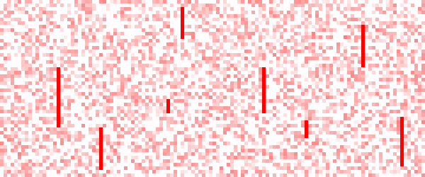
Every so often, all CPUs max out for 100s of ms. (Eg, GC).
16. CPU blocking

Every so often, all CPUs idle for 100s of ms. (Eg, I/O).
17. Single-threaded blocking

Every so often, all CPUs idle except one (pink lines, not white) (Eg, global locks).
The last pattern is especially interesting: it happens when all threads are blocked on a lock, which is held by one thread that's running on-CPU. What's that thread doing? Just click the pink line in FlameScope and now you're looking at its flame graph. This makes analyzing a difficult performance problem trivial.
Conclusion
Now what can you see?:
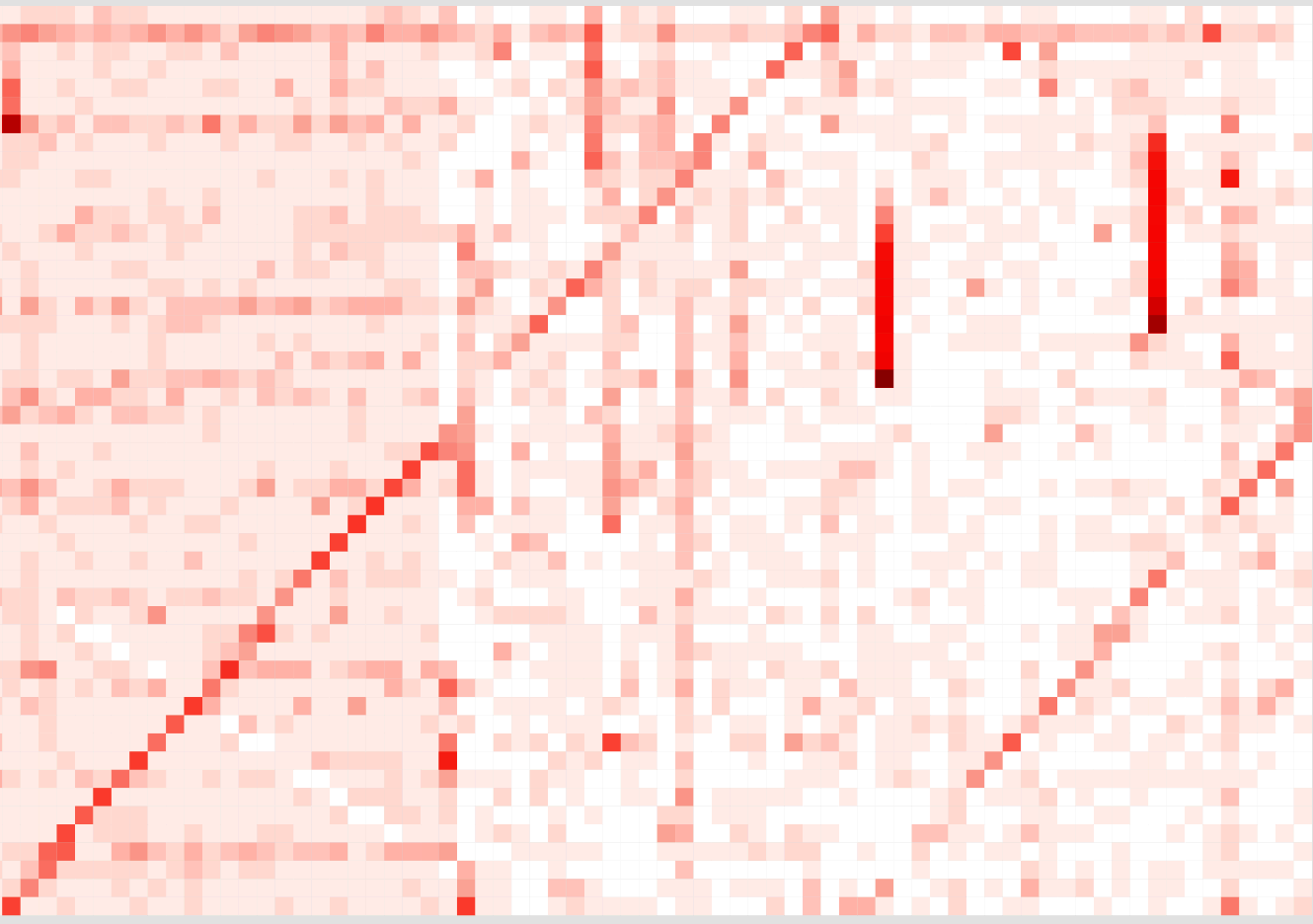
You now speak flame scope. In the real flame scope tool, you can select each of those patterns, and a flame graph will be shown that explains the code paths responsible.
Tonight I'm giving a talk at the LinkedIn performance meetup on FlameScope with my colleague Martin Spier, who has done most of the development work for the Netflix/FlameScope tool.
Good luck FlameScoping, and please share screenshots of the interesting patterns you encounter!
Brendan
You can comment here, but I can't guarantee your comment will remain here forever: I might switch comment systems at some point (eg, if disqus add advertisements).
如有侵权请联系:admin#unsafe.sh