
This article will be useful for product designers who work on complex interfaces, long forms, onboar 2026-7-9 20:44:29 Author: hackernoon.com(查看原文) 阅读量:24 收藏
This article will be useful for product designers who work on complex interfaces, long forms, onboarding flows, financial products, and services where users need to make decisions.
Digital fatigue is a state where the user generally understands what to do, but the interface takes too much attention and energy. They see too many buttons, long screens, dense text, equally important blocks, and many options. At some point, they stop reading carefully. They start scrolling, skipping important information, clicking randomly, or closing the product.
It is important to understand: users do not always leave because the product is bad. Often, they leave because the path to the result feels too exhausting.
Let’s look at what causes digital fatigue and how to reduce it.
Why users get confused.
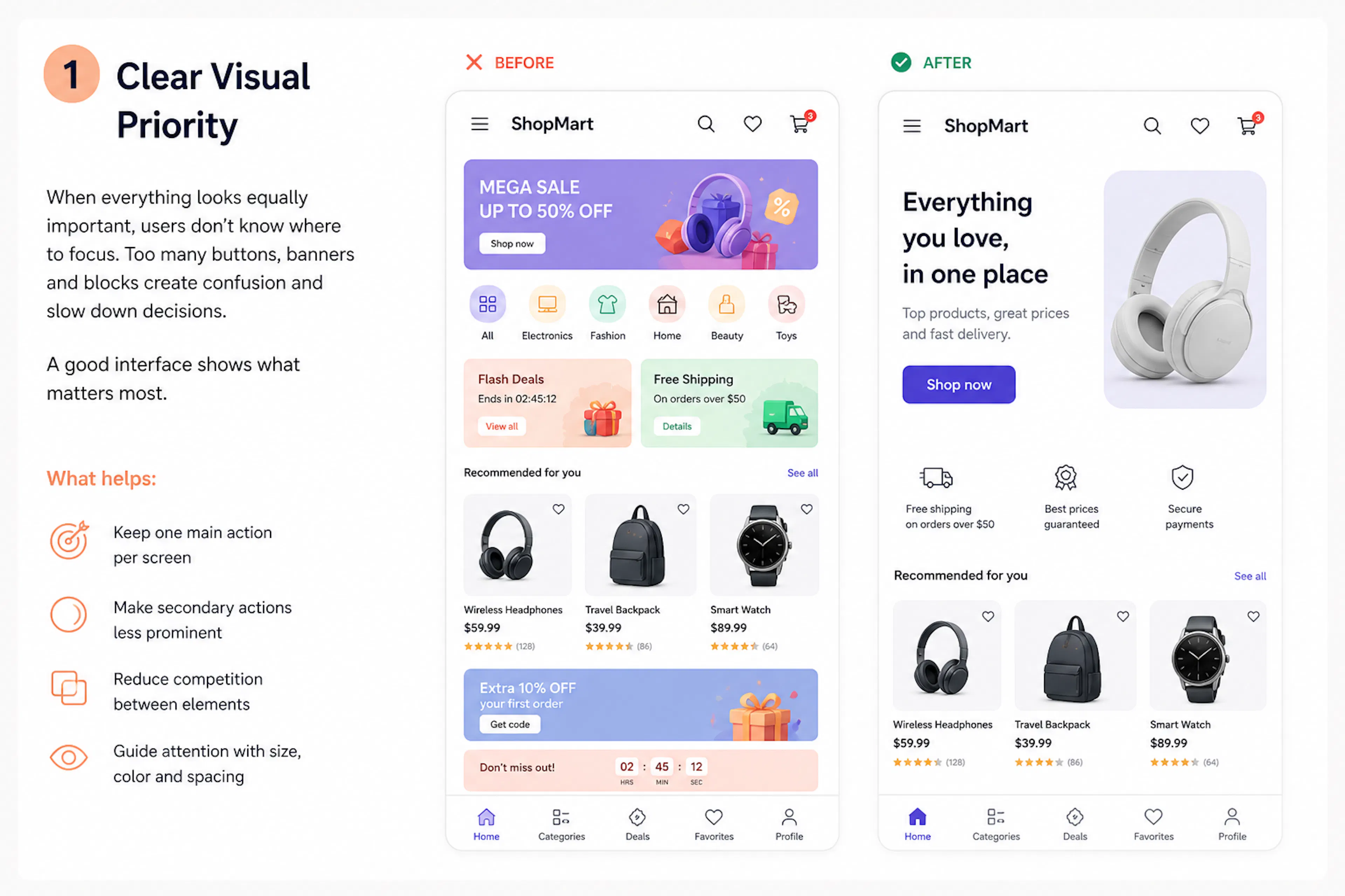
One of the main reasons is the lack of visual priority. For example, imagine a marketplace screen where the user sees banners, product cards, promotions, categories, badges, prices, discounts, and several buttons at the same time. Everything looks useful, but everything tries to get attention.
When too many elements have the same importance, users don’t know what to focus on. They need to decide where to look first. This creates extra cognitive load. The same happens when multiple buttons look equally important. For example, “Back” and “Confirm” are placed next to each other and look almost the same. The user pauses and thinks: What will happen if I click this?
A good interface does not force users to analyze every screen. It shows what is important.
What helps:
- keep one main action per screen
- make secondary actions less visible
- reduce competition between elements
- guide attention with size, colour, and spacing
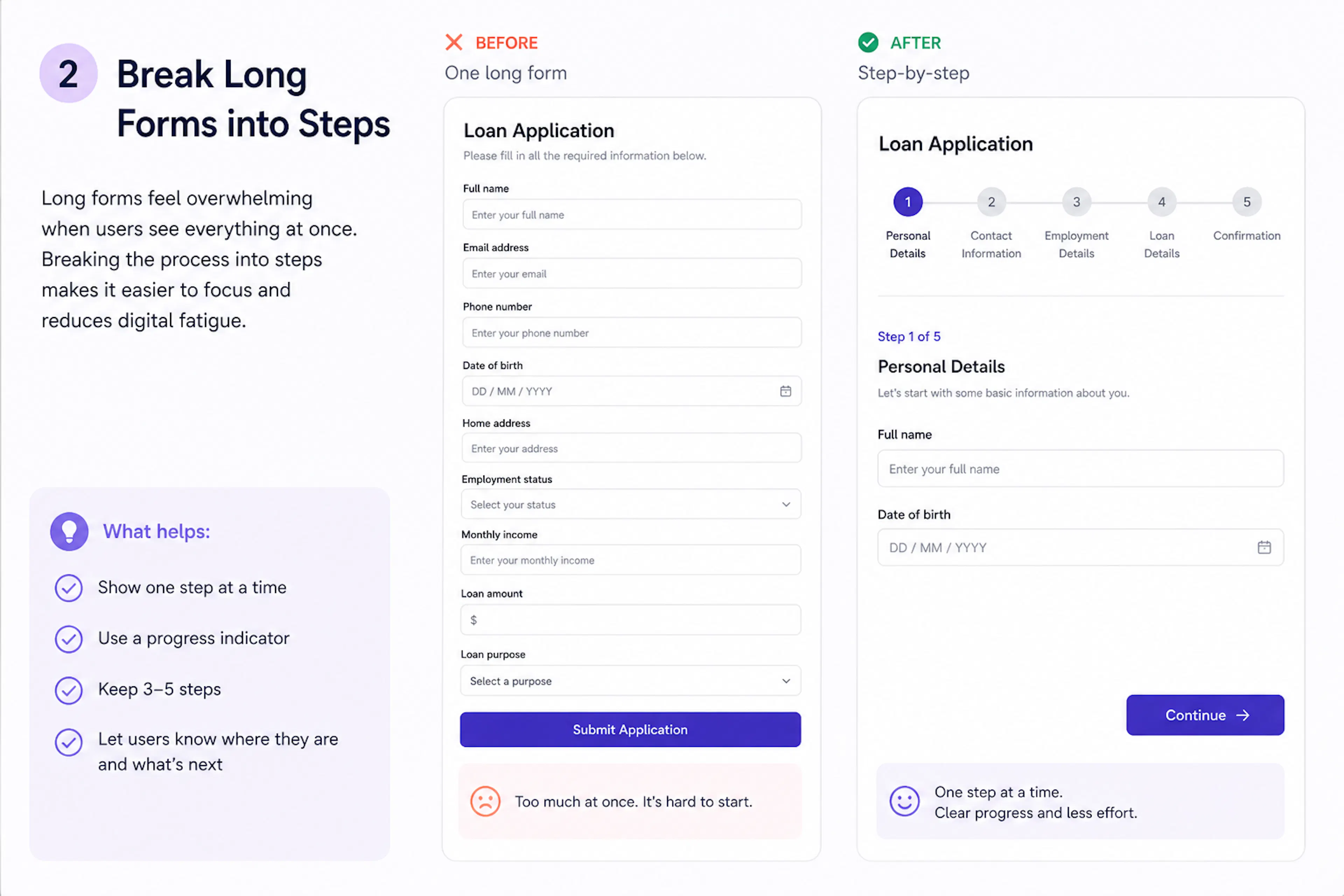
Let’s take an example of a long application form. It looks standard: fields for name, email, phone, date of birth, address, job, income, and amount. Each field is simple. But together, they create a feeling of a heavy process. The user hasn’t started yet, but already sees a lot of work.
This is where digital fatigue appears. Not because the form is complex, but because the interface does not guide the user step by step. This is especially critical in financial products and onboarding. The user has not received value yet, but already needs to spend effort.
That’s why it is better to split the process into steps.
For example:
- personal details
- contact information
- employment details
- application details
- confirmation
Now, the user sees a clear path instead of one long form. If you add a progress indicator, it becomes even easier — the user understands where they are and how much is left.
Important: don’t create too many steps. Usually, 3–5 is enough.
Too much effort for too little value.
Another reason for fatigue is when users spend effort but don’t understand why.
For example, they fill in a form, go through several screens, and confirm data, but it is not clear what they will get in the end. In this case, many users drop off. That’s why it is important to explain value at each step. Instead of a dry step name, explain the reason.
For example:
“Tell us about your job”
This helps us calculate your available options
Now, the user understands why they need to enter this data. Progress also helps. When users see they are close to the end, they are more likely to continue.
What helps:
- explain why you ask for data
- show progress
- save entered information
- use autofill where possible
- remove unnecessary questions
Every choice is a small effort.
Let’s take a payment screen with several options. This is fine if the choice is needed. But if the system already knows user preferences, it is not necessary to ask every time. For example, if a user has a saved card, you can select it by default and show other options as secondary. The same applies to settings, filters, delivery options, and other parameters. The more decisions users need to make, the faster they get tired. A good interface does not remove control. It offers smart defaults.
For example:
- last used payment method is selected
- country is detected from phone number
- date format matches the region
- language matches device settings
These small details reduce effort and make the interface feel easier.
Text also creates load.
It often feels like more explanation is better. In reality, long texts are rarely read.
Users scan the screen and look for answers to three questions:
- what is happening
- what should I do
- what will happen next
If the answer is hidden in a long paragraph, it can be missed. That’s why the main idea should be in the title, and details should be shown only when needed.
For example, instead of a long warning:
“Please carefully review the information before continuing, as it may affect your future actions”
Better:
“Review your payment method”
This card will be used for future payments
This is easier to understand.
In complex products, you cannot remove all text, but you can structure it:
- main idea in the title
- short explanation below
- details on demand
Grouping makes screens easier.
If elements are not grouped, users see them as separate tasks. For example, first name, middle name, and last name are three fields, but one task. In some cases, they can be combined into one field: full name. The same works for address, contacts, and payment details. Grouping reduces the feeling of complexity. The screen may have the same amount of information, but it feels simpler.
For example:
- Personal details
Name
Date of birth - Contact details
Email
Phone - Application details
Amount
Purpose
This structure is easier to scan and complete.
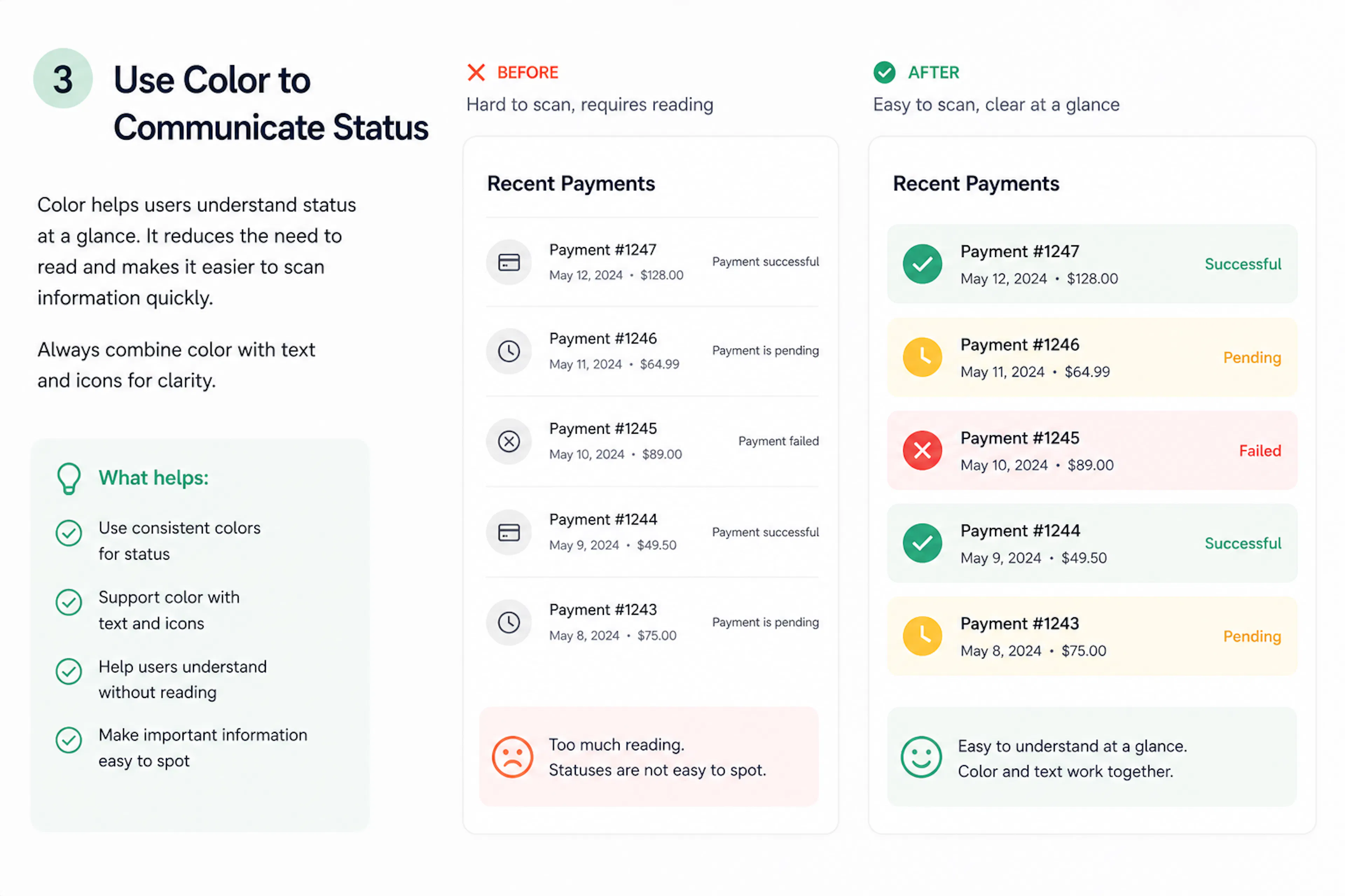
Color helps understand status faster.
Color helps users understand status without reading.
- green — success
- yellow — in progress
- red — error
This is especially useful in products with many statuses: payments, orders, and applications. But color should not be the only signal. It should be supported with text and icons.
For example:
“Error”
Payment was declined
Now, the user understands both the problem and the reason.
How to check your interface.
To understand if a screen creates digital fatigue, ask:
- Is there one main action?
- Can I understand the screen in a few seconds?
- Do elements compete for attention?
- Can I reduce text?
- Is there progress in long flows?
- Can I reduce the number of choices?
- Does the screen feel heavier than the action?
If some answers are “no”, the interface can be improved.
Conclusion
Digital fatigue does not come from the number of screens.
It comes from the amount of effort.
One extra field. One long paragraph. Two equally strong buttons. Several choices where one default would be enough. Each detail seems small, but together they overload the user.
To reduce digital fatigue, you don’t need to redesign everything. Often it is enough to:
- split the process into steps
- group elements
- highlight one main action
- reduce text
- remove unnecessary choices
- use color for status
- show progress
A good interface does not make users think about the interface itself.
It simply helps them reach the result.
如有侵权请联系:admin#unsafe.sh